Unboxing Big Data
Exploring the intersection of high-density data architecture and organic visual design.


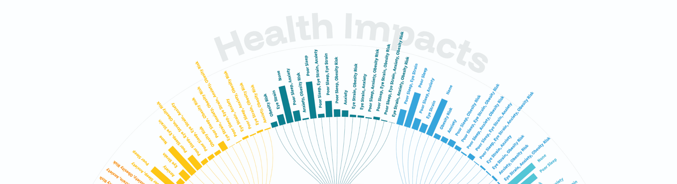
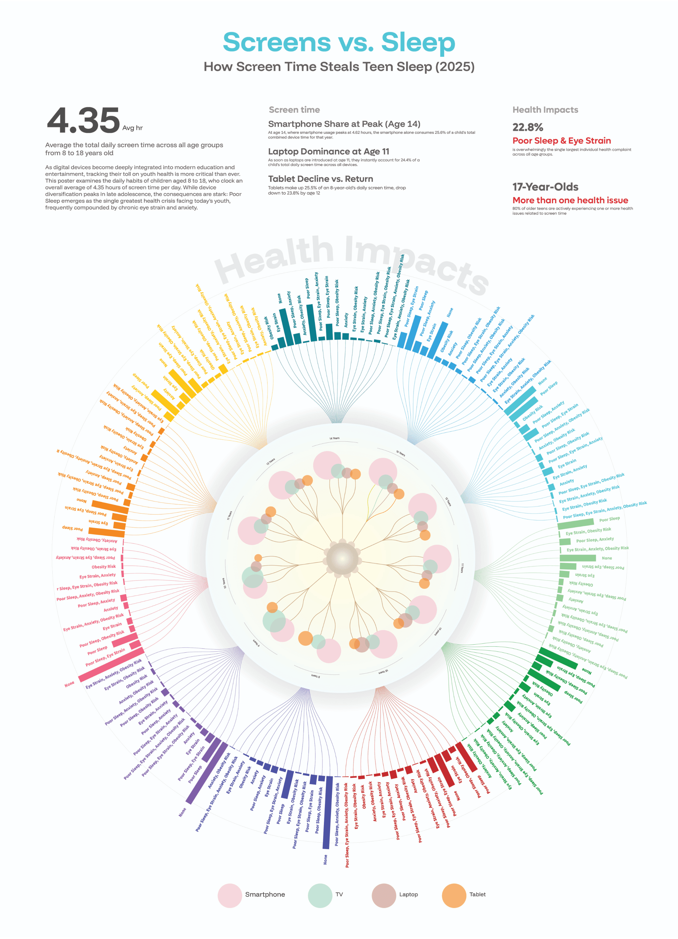
Peak Device Hand-offs: At age 11, laptops spike to 24.4%, while smartphone share dominates at age 14, claiming 25.6% of the daily profile.
Co-occurring Symptom Nodes: The visual ties overlapping conditions together. Poor sleep and eye strain make up 22.8% of all recorded symptoms.
Sustained Teen Vulnerability: 80% of older teenagers (age 17) actively experience more than one concurrent health threat due to late-night exposure.
2.
Israel Palestine Conflict
A rigorous, objective spatial-temporal
breakdown of military munitions and casualties
from 2000 to 2023.

Objective Clarity
Mapping casualties of a highly sensitive historical standoff demands absolute clarity and lack of sensationalism, emphasizing rigorous geometric scaling.
Weighted Bloom
Instead of traditional flat line trends, a custom "weighted bloom" model was conceptualized, hanging visual indicators resembling botanical stems to visualize volume changes.
Dual Chronologies
Spatially segregating Palestinian and Israeli records into a mirrored timeline to represent extreme structural asymmetric differences objectively.
Designing the Narrative: Beyond the Standard Timeline
When I first looked at the raw historical data for this project, I realized a traditional flat line graph or a standard stacked bar chart would completely flatten the gravity of the story.
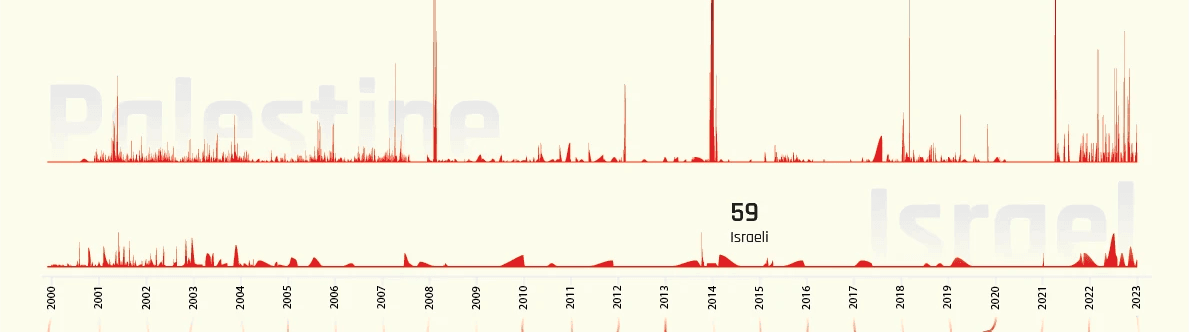
The top half of the timeline tracks the daily density of fatalities. By mirroring the two data streams natively, the absolute asymmetry of the conflict becomes instantly apparent at a single glance, mapping sharp spikes against historical baselines.
Mapping Weaponry Over Time
When it came to visualizing categorical data as dense and sensitive as ammunition types, a standard stacked bar chart simply wouldn't cut it. Stacked columns feel rigid and corporate; they turn human history into a sales report.
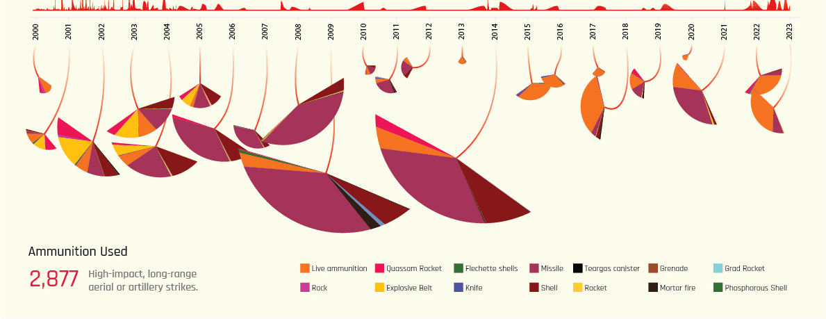
The overall scale of each fan-like petal is mathematically locked to the absolute volume of ammunition occurrences for that specific year. You can instantly see the massive tactical shifts in years like 2008, 2009, and 2014 simply by reading the massive physical expansion of those specific blooms.
Full Chart

Ultimately, this creative layer transforms a cold, unreadable Kaggle spreadsheet into a living data ecosystem. It allows publication editors and data teams to immediately track the micro-evolution of military and militant tactics over two decades at a
single glance.
© Saurabh Shiwankar 2026
Behance
Dribble