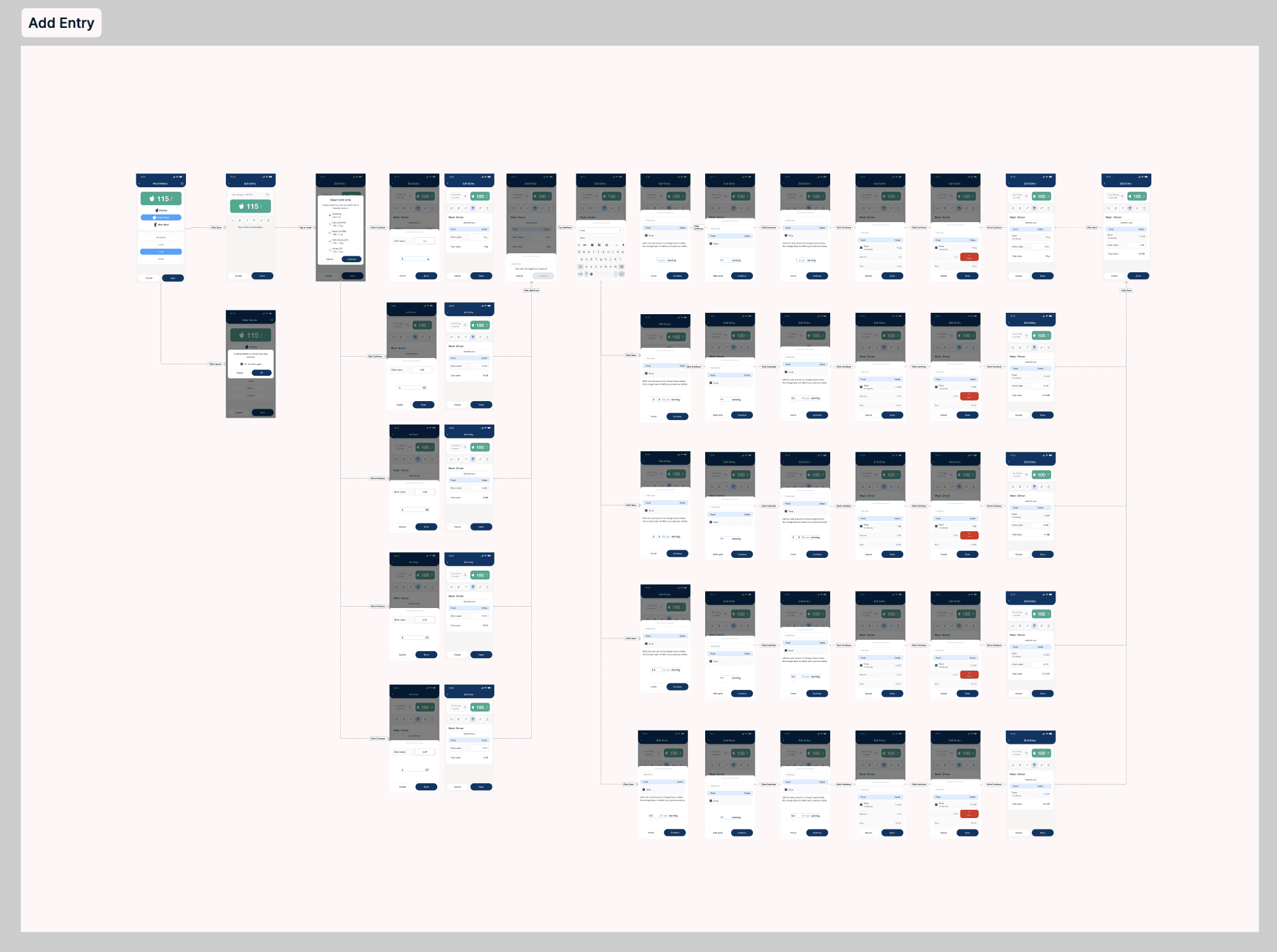
How We Redesigned the Diabetes App to Empower Older Adults with Accessible, User-Centered Tools

How We Redesigned the Diabetes App to Empower Older Adults with Accessible, User-Centered Tools

How We Redesigned the Diabetes App to Empower Older Adults with Accessible, User-Centered Tools

Design and elements are changed due to NDA

Role:

Lead UX Designer

Client:

Ascensia Diabetes Care

Company:

Designit

Date / Duration

May 2024 - Currently ongoing

Contour Diabetes App

Product:

Product:

Companion app for connected glucose meters

Scope:

Scope:

UX research, concepting, prototyping, testing, handoff, and development support

Key Contributions & Responsibilities:

Key Contributions & Responsibilities:

Conducted user interviews to uncover key diabetes challenges.

Collaborated with PMs, clinical leads, and developers.

Created and tested multiple design concepts.

Built a scalable, compliant design system.

Delivered accessible, patient-friendly UI designs.

1.2M+ users worldwide:

Europe (48%) and North America (43%), while Asia‑Pacific—including India—represented only 4.5% of the active base.

Impact Matrix

We tested the redesign through live workshops and A/B testing with the users, focusing on engagement and usability. The new version showed a higher satisfaction scores.
90%

90%

Users found easier to navigate

Users found easier to navigate

25%

25%

Average Reduce navigation time

Average Reduce navigation time

32%

32%

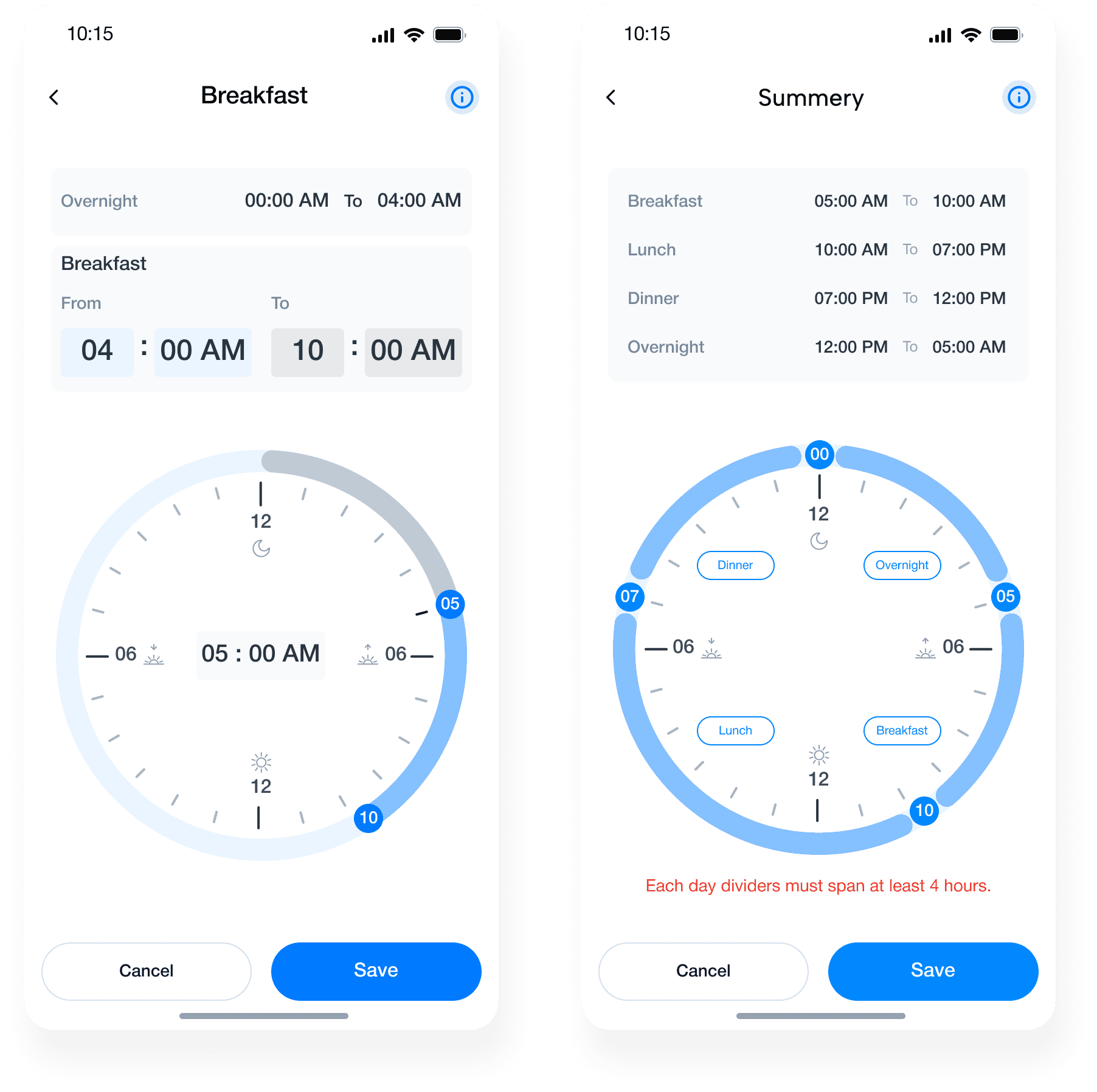
Reduced time to Meal marking

Reduced time to Meal marking

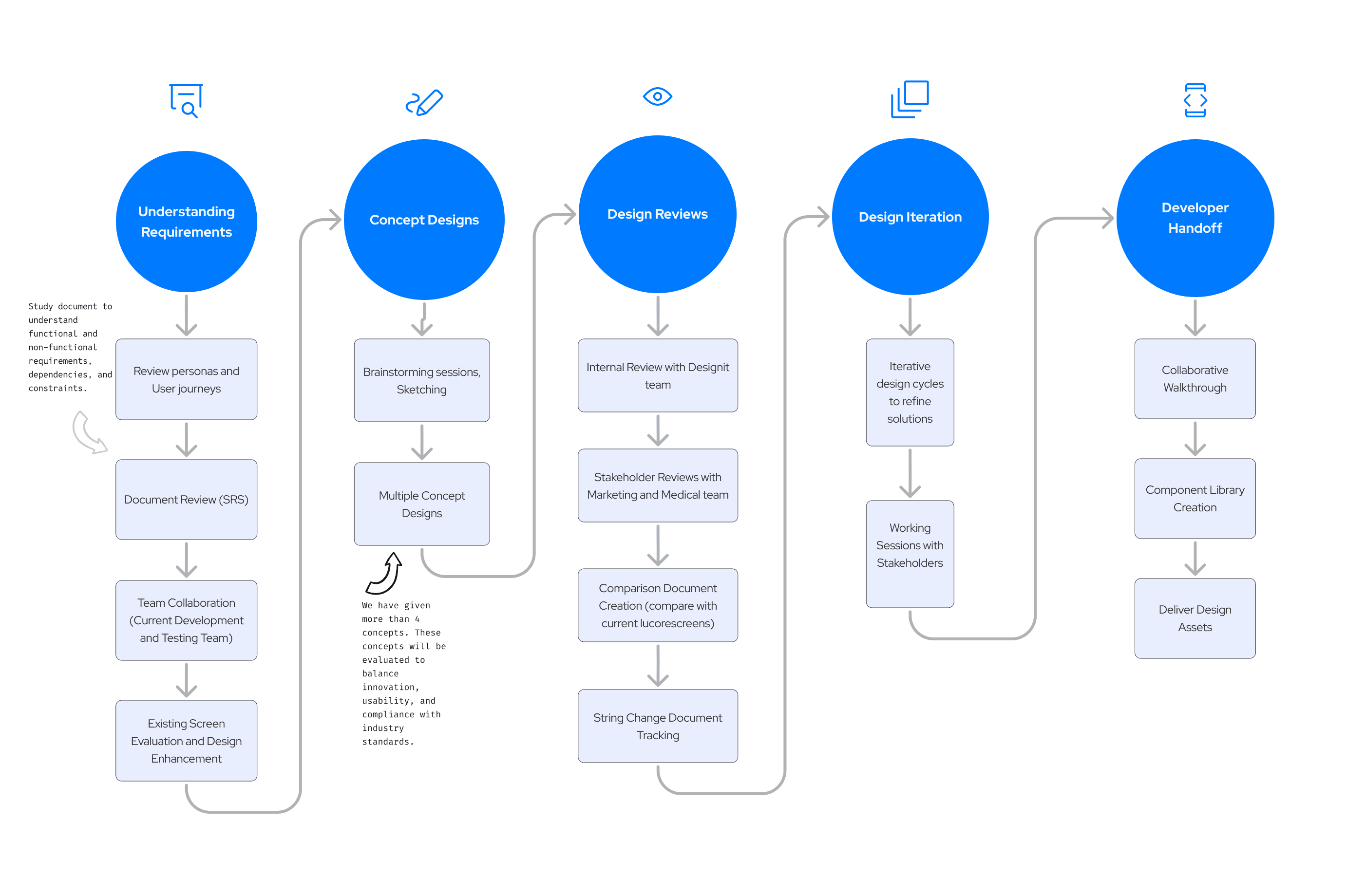
Design Process

Design Process

Stakeholders and Team

Stakeholders and Team

To identify, categorize, and manage stakeholders based on their influence on the product and interest in the redesign — especially as the project was accessibility-led and clinically regulated.

Discover

Discover

Existing Application Evaluation

Objectives

Existing Application Evaluation

Issues

Objectives

Issues

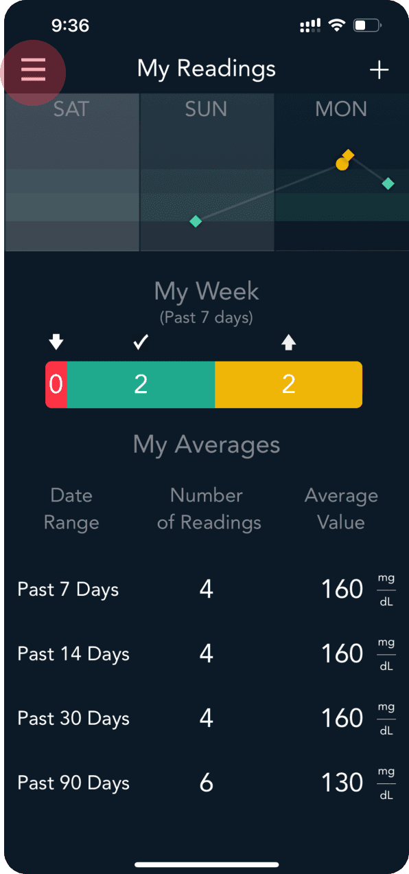
Graph Issues: Visuals are too small and unclear—users can’t tell if values are averages or single readings.

Graph Clarity: SAT–MON graph is too small ; unclear if dots are readings or averages.


Expand view: No action to expand graph


Location Pin: Appears at 8:17 PM without context.


"My Week" Bar: Week and 7 days are same information.


"My Week" Bar: Week and 7 days are same information.

Poor Contrast & Small Text: Low visibility in dark mode and text too small for accessibility.

Graph Clarity: SAT–MON graph is too small ; unclear if dots are readings or averages.


Expand view: No action to expand graph


Location Pin: Appears at 8:17 PM without context.


"My Week" Bar: Week and 7 days are same information.


"My Week" Bar: Week and 7 days are same information.

Color Dependence: Critical info shown only through color—non-inclusive for colorblind users.

Graph Clarity: SAT–MON graph is too small ; unclear if dots are readings or averages.


Expand view: No action to expand graph


Location Pin: Appears at 8:17 PM without context.


"My Week" Bar: Week and 7 days are same information.


"My Week" Bar: Week and 7 days are same information.

Cluttered UI & Inconsistent Fonts: Visual hierarchy is weak and typography lacks standardization.

Graph Clarity: SAT–MON graph is too small ; unclear if dots are readings or averages.


Expand view: No action to expand graph


Location Pin: Appears at 8:17 PM without context.


"My Week" Bar: Week and 7 days are same information.


"My Week" Bar: Week and 7 days are same information.

Hidden Navigation: Hamburger menu hides key features, making discovery harder.

Graph Clarity: SAT–MON graph is too small ; unclear if dots are readings or averages.


Expand view: No action to expand graph


Location Pin: Appears at 8:17 PM without context.


"My Week" Bar: Week and 7 days are same information.


"My Week" Bar: Week and 7 days are same information.

Confusing Interactions: Actions like meal tagging or saving are not clearly separated or explained.

Graph Clarity: SAT–MON graph is too small ; unclear if dots are readings or averages.


Expand view: No action to expand graph


Location Pin: Appears at 8:17 PM without context.


"My Week" Bar: Week and 7 days are same information.


"My Week" Bar: Week and 7 days are same information.

Knowing the Target User Groups

Knowing the Target User Groups

It shaped how we approached accessibility, language, layout, and emotional reassurance in the product.

It shaped how we approached accessibility, language, layout, and emotional reassurance in the product.

People Living with Diabetes (Type 1 and Type 2)

People Living with Diabetes (Type 1 and Type 2)

Older Adults (50+)

Older Adults (50+)

Caregivers and Family Members

Caregivers and Family Members

Healthcare Providers (indirectly)

Healthcare Providers (indirectly)

Stakeholders Workshops

Stakeholders Workshops

Stakeholders Workshops

3 Total

Stakeholder workshops conducted over the course of discovery and concepting.

6 participants


(PM, Regulatory, Clinical Advisor, UX Lead, Dev Lead, Marketing)

Mode:

Remote (Miro + Zoom)

Objectives

Objectives

Objectives

1

Business Goals & Product Vision

Business Goals & Product Vision

2

User Journey Mapping & Pain Points

User Journey Mapping & Pain Points

3

Concept Alignment & Prioritization

Concept Alignment & Prioritization

User interview points

User Pain Points

User Pain Points

Overwhelming UI

"It would be easier if the app showed visuals that tell me whether I’m in control or not".

Navigation Frustration

“It takes me 4 taps to get to my logbook. That’s too much.”

Text Descriptions

“Texts are confusing have to read entire help section to understand.”

Accessibility

“I have trouble reading some of the text, especially on my phone at night.”

Trust & Motivation

“I wish it would give me a pat on the back when I have a good week.”

Data Sharing

“It’s annoying to export the report — I need something easier before my checkups.”

Problem Statement

Problem Statement

The Diabetes App, a companion to blood glucose monitoring devices, had not undergone a major redesign in over 15 years. As a result, users—particularly those managing diabetes daily—faced a cluttered interface, unintuitive navigation, and accessibility barriers that hindered consistent usage and trust.

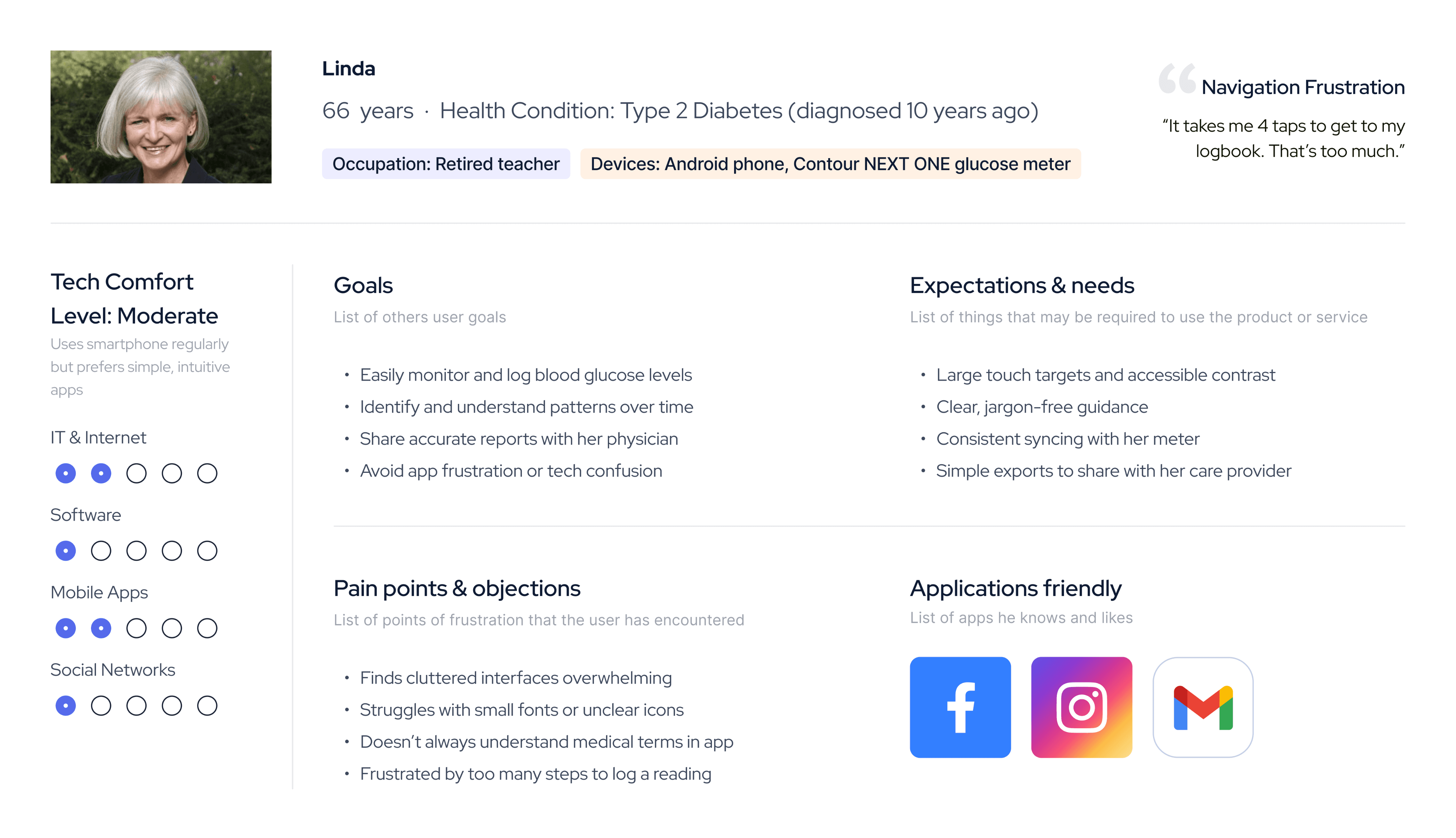
User Persona

User Interviews

Interview Objectives:

Understand how users currently interact with the app, their pain points, and what features they value.

Participants


5 Diabetes App users (aged 30–70)

Mix of newly diagnosed and long-term diabetics

Balanced across Android/iOS and tech fluency levels

Define

Define

How we can redesign it?

Concept Presentation

Concept Presentation

40+ Iterations

40+ Iterations

Final Designs Solutions

Final Designs Solutions

Core Focus Areas of the Redesign

Core Focus Areas of the Redesign

Challenges

Making Scalable Components for 29 different languages

We iterated and checked whether some languages have longer texts; this repetition of the components gave us confidence about the sizes of the components.

The example is given for navigation bar; similarly, we have tried to use other components.

Handling Multilingual and RTL Design Challenges

Our default Brand font for English (Helvetica Neue, 12px) offered a clean look. However, Arabic text brand font is Arial appeared thin and unbalanced, especially in UI components.
Arial lacked a medium weight, making it hard to achieve parity with Latin typography.

Font:

Size:

Weight:

Visual:

Helvetica Neue

12px

Medium

UI snippet or button using this style

Looks balanced, readable, sharp

Multiple iterations gave the solutions

Increased Arabic font size for better legibility and visual balance

  • Applied style overrides: darker text, adjusted padding

  • Added Arabic-specific typography tokens
    (e.g., body-ar, button-ar)

  • Built component variants that auto-adjust by locale

  • Validated changes with native speakers and
    cross-platform QA

Appears thinner, weaker visual hierarchy

Font:

Size:

Weight:

Visual:

Arial

16px

Regular (no medium available)

Same UI snippet or button in Arabic

Challenges in Analyzing Against Target Ranges

Difficulty in Interpreting Glucose Trends Over Time

“I have to remember my targets and interpret the numbers myself. It feels static and lacks context to quickly understand my progress.”

Iterate… iterate… and iterate

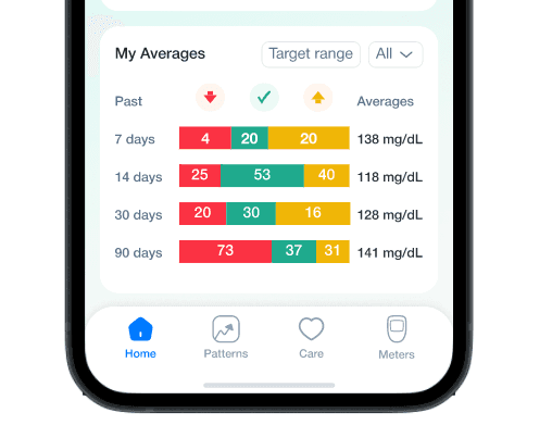
We conducted multiple iterations and incorporated direct user inputs to make the "My Averages" graph more efficient for our user groups.
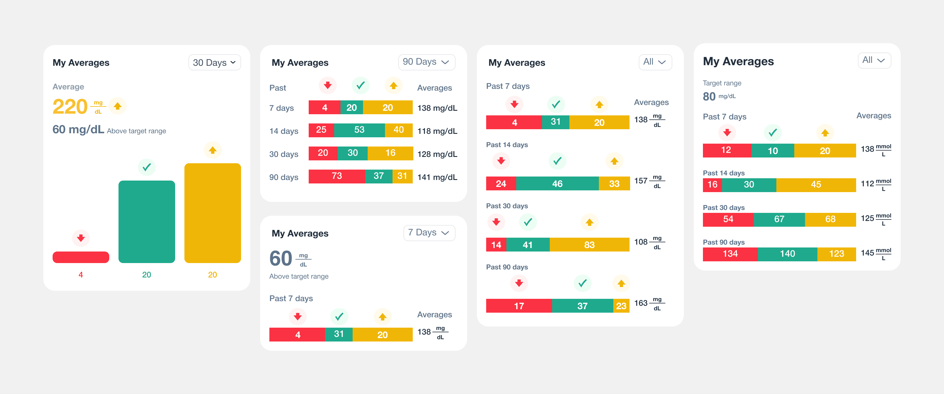
Before & After

Our redesign strategy aimed to resolve this by combining relevant graphs and enabling direct access to target range visualization, empowering users to easily compare trends and gain actionable insights from their average glucose data.

Outcomes
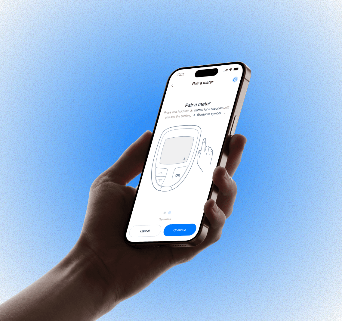
Pair your glucose meter

Pair your glucose meter

Personalized glucose and meal tracker

Existing design

Existing design

Redesigned screens

Personalized glucose and meal tracker

Personalized glucose and meal tracker

Existing design

Existing design

Redesigned screens

WCAG 1.3.4 Orientation

Level AA (Added in 2.1) the designs have been done referring to accessibility standards, wherever it was applicable.

Level AA (Added in 2.1) the designs have been done referring to accessibility standards, wherever it was applicable.

Expanded graph view


Arabic Language Support

Arabic Language Support

The app has adopted a design system tailored for Arabic language support and scalability, which is essential for successful expansion in Arabic countries. Key adaptations include comprehensive RTL (right-to-left) design, Arabic-optimized typography, modular components.

The app has adopted a design system tailored for Arabic language support and scalability, which is essential for successful expansion in Arabic countries. Key adaptations include comprehensive RTL (right-to-left) design, Arabic-optimized typography, modular components.

Thanks

Thanks

This project is currently under development and under NDA. I led the UX design from research to handoff, focusing on accessibility, healthcare compliance, and user-centered design.

This project is currently under development and under NDA. I led the UX design from research to handoff, focusing on accessibility, healthcare compliance, and user-centered design.

Design System Creation

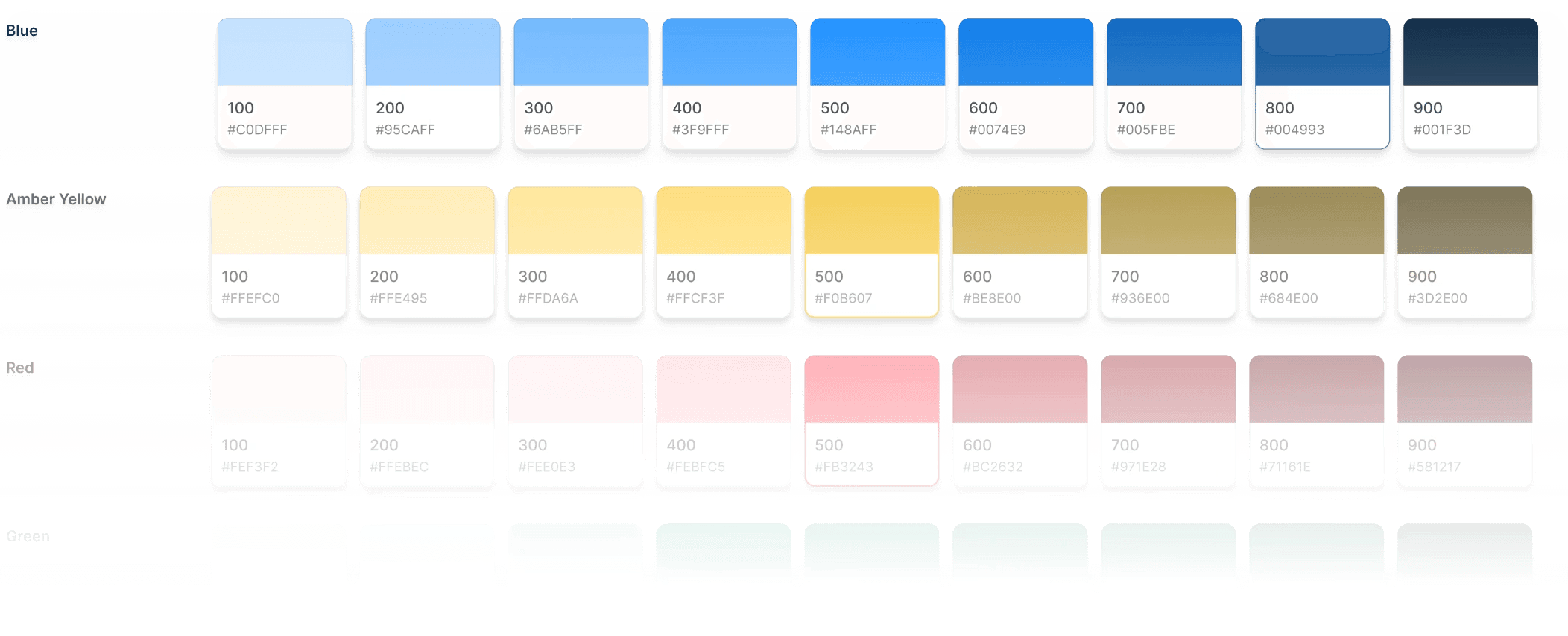
Colors

Colors

Colors support clarity without overwhelming diabetic users, especially older adults.

Colors support clarity without overwhelming diabetic users, especially older adults.

Colors Based on Glucose Range

Colors Based on Glucose Range

Colors support clarity without overwhelming diabetic users, especially older adults.

Colors support clarity without overwhelming diabetic users, especially older adults.

Typography

Typography

Typography

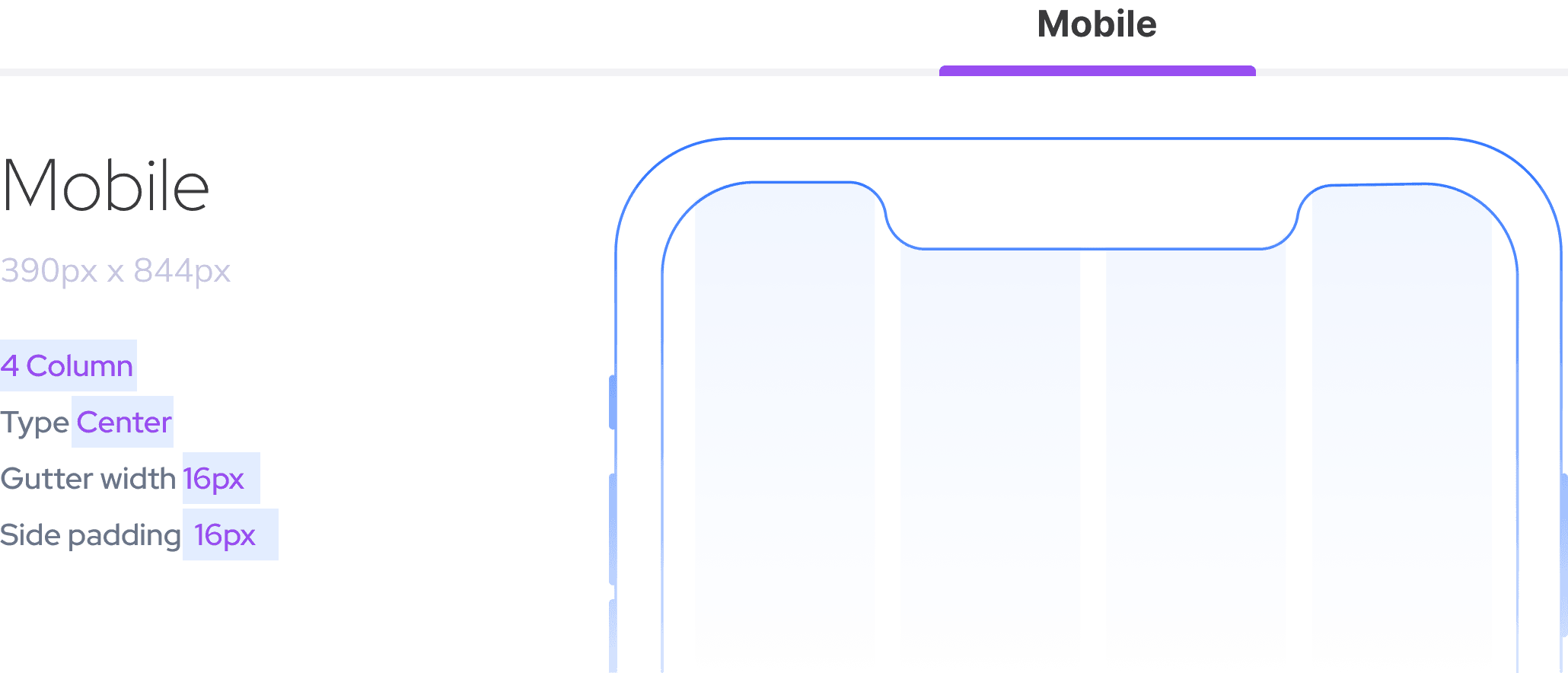
Grids

Grids

Deliever

Deliever

Development Support

Development Support

Project management and design efforts are now complete, with all deliverables finalized, timelines met, documentation in place, and all story points successfully closed in Azure to support a smooth transition into development.

Project management and design efforts are now complete, with all deliverables finalized, timelines met, documentation in place, and all story points successfully closed in Azure to support a smooth transition into development.

© Saurabh Shiwankar 2023

LinkedIn

Behance

Dribble

Instagram

User Persona

User Persona

Target User Groups

It shaped how we approached accessibility, language, layout, and emotional reassurance in the product.

People Living with Diabetes (Type 1 and Type 2)

Older Adults (50+)

Caregivers and Family Members

Healthcare Providers (indirectly)

Create a free website with Framer, the website builder loved by startups, designers and agencies.